Keystone Crossing laptop
The design for Keystone Crossing’s new logo started with a noun exercise to create a list of tangible ideas that function as symbols for a premier mixed-use business campus.
Keystone Crossing logo grid
Keystone Crossing logo black
A logo that creates impact through simplicity.
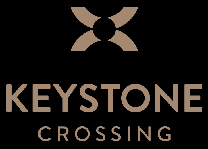
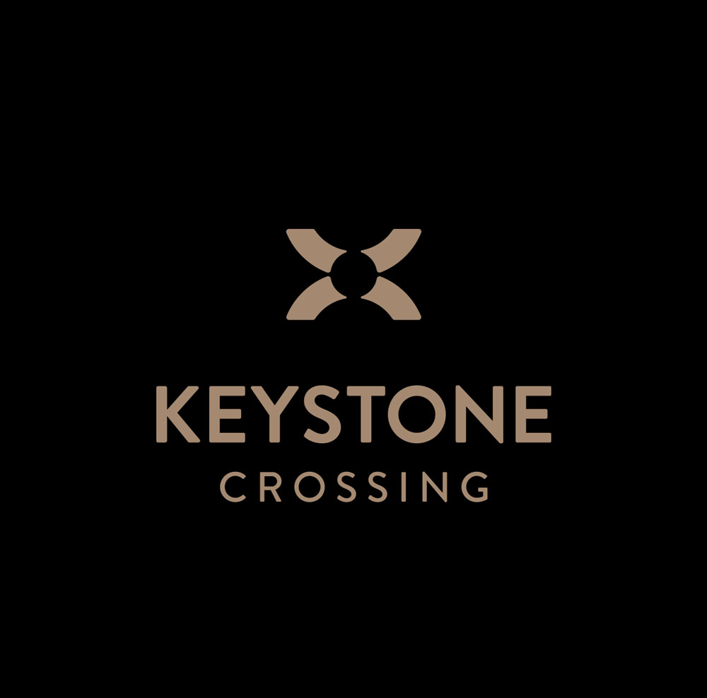
Two broad, sweeping lines intersect to form an X with negative space at the center. This bold, minimal shape anchors the brand, while evenly weighted letterforms add a sense of gravitas. Its geometry echoes the individual building logos, creating a cohesive visual language across the property.
Keystone Crossing color palette
Keystone Crossing icons fonts
See The Brand In Action